
Colour Pairing in Home Décor: How to Mix Neutrals & Accents
Share
Colour Pairing in Home Décor: How to Mix Neutrals & Accents
Colour is one of the most powerful tools in home décor. It sets the tone, creates atmosphere, and brings personality into a space. A carefully considered colour palette can make a room feel larger, warmer, more inviting, or more energising, depending on the shades you choose and how you balance them.
Yet, for many people, choosing and combining colours feels intimidating. Neutrals feel “safe,” but without accents they can seem flat. Bright hues add energy, but when overused they can overwhelm. The secret to successful decorating lies in pairing base neutrals with accent colours in a way that feels intentional and harmonious.
In this post, we’ll explore how to build a timeless neutral foundation, introduce accent shades with confidence, and use simple rules to balance your palette. Plus, we’ll share practical product pairings that show how this approach works in real life.
1. Build Your Foundation with Base Neutrals
Every well-balanced interior begins with a foundation. Neutrals—shades like ivory, taupe, beige, pale grey, and soft white—create a backdrop that feels calm, timeless, and versatile.
Why neutrals work so well:
- Versatility: They complement nearly every colour, making them an ideal canvas for layering accents.
- Calming effect: Soft, muted tones create a sense of serenity, perfect for bedrooms, living rooms, and open-plan spaces.
- Longevity: Neutrals rarely go out of style, so you can refresh your décor seasonally without having to redecorate completely.
When planning your foundation, think about the mood you want to set. For example:
- Warm neutrals (beige, cream, camel): Perfect for creating a cosy, inviting atmosphere.
- Cool neutrals (grey, soft white, pale stone): Ideal for contemporary, minimal spaces.
- Earthy neutrals (taupe, mushroom, greige): A great middle ground, bringing sophistication and warmth.
A grey upholstered bed, a beige sofa, or pale oak flooring—these pieces form the “backdrop” that you’ll later layer with accent colours.
2. Add Personality with Accent Colours
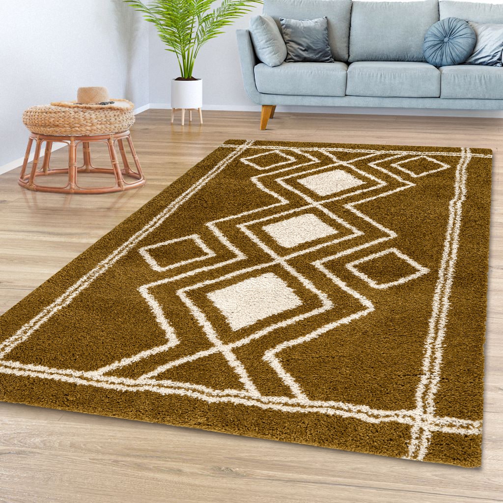
Once your neutral base is in place, it’s time to introduce colour. Accents are the shades that bring life and vibrancy into a room. You don’t need to repaint walls or commit to bold furniture—accents work beautifully through smaller, interchangeable elements such as cushions, throws, rugs, artwork, and decorative accessories.
Here are four timeless accent shades that work across a variety of styles:
- Navy Blue: Classic and sophisticated, navy adds depth and pairs beautifully with greys, whites, and metallics like brass or gold. Think of a navy throw draped across a pale bedspread, or a deep blue velvet cushion against an ivory sofa.
- Emerald Green: Vibrant yet elegant, emerald injects a sense of nature and luxury. An emerald rug under a neutral dining set, or a few green glass vases on a beige sideboard, instantly refreshes a space.
- Russet: This warm, earthy tone brings cosiness and richness, making it perfect for autumn-inspired palettes. Russet cushions or terracotta ceramics on pale shelves add warmth without dominating.
- Blush Pink: Soft and subtle, blush adds warmth and romance. It works especially well with taupe, ivory, and gold accents, softening sharper modern interiors.
The key is not to overdo it. By keeping accents confined to smaller pieces, you can refresh your look seasonally or whenever your tastes change—without major expense.
3. Find Harmony with the 60-30-10 Rule
One of the easiest ways to balance your colour scheme is to follow the 60-30-10 rule. This timeless interior design principle helps you distribute colour in a way that feels harmonious and intentional.
- 60% – Base Neutral: Your walls, flooring, large furniture pieces (sofas, beds, cabinets). This is the dominant tone in the room.
- 30% – Secondary Colour: A supporting shade, which could be a darker neutral (like charcoal against ivory) or a muted version of your accent. This often appears in curtains, feature chairs, or larger rugs.
- 10% – Accent Colour: The “pop” that brings contrast and personality. Cushions, artwork, lampshades, and small décor pieces are perfect for this.
For example:
- Living Room Palette: 60% pale grey walls and sofa, 30% charcoal rug and curtains, 10% emerald cushions and art.
- Bedroom Palette: 60% ivory bedding and walls, 30% blush upholstered headboard, 10% gold lamps and blush throw.
By following this simple ratio, you ensure your room feels layered and cohesive without veering into chaos or monotony.
4. Real-Life Product Match
To show how this works in practice, let’s take a quick look at one cohesive pairing:
- Grey Bed (Base Neutral): A soft grey upholstered bed provides a calming, versatile foundation.
- Noah Coral Rug (Accent): A bold rug in coral adds warmth and colour underfoot, lifting the space instantly.
- Gold-Accented Mirrors (Secondary + Accent): A pair of mirrors with gold detailing introduces light, elegance, and contrast.
Together, this trio demonstrates the formula beautifully: neutral base, bold accent, and metallic detail for a touch of luxury.
5. Practical Tips for Confident Colour Mixing
If you’re hesitant about experimenting with colour, here are a few beginner-friendly tips:
- Start small. Try adding one or two accent cushions before investing in larger accent pieces.
- Use nature as inspiration. Forests, beaches, and landscapes often combine neutrals with accents naturally.
- Test before committing. Place a rug or artwork in the space for a week—see how it feels before buying complementary pieces.
- Repeat accents. For balance, repeat the same accent colour in at least three places (e.g., a cushion, a vase, and a piece of art).
- Layer textures as well as colour. A navy velvet cushion looks very different from a navy linen one. Texture adds depth.
Final Thought: Colour Confidence Starts Small
Colour in home décor doesn’t have to be daunting. By starting with a neutral base, adding accents in small, considered ways, and using the 60-30-10 rule for balance, you can create interiors that feel both stylish and personal.
Remember, accents are designed to be flexible. They can evolve with the seasons—blush and ivory in spring, emerald and navy in winter—or shift as your taste develops.
If you’re ready to begin, start small. Swap out a cushion, add a new rug, or bring in a piece of art that speaks to you. Each choice builds confidence, and over time you’ll create a palette that feels uniquely yours.
So, take that first step. Update your palette with confidence—because sometimes the smallest accent makes the biggest difference.